10 Color Combinations That Always Look Expensive
If you dress expensive, one fool-proof way is picking the right color combinations. In today’s post, I’m sharing the 10 color combinations that always look expensive because it’s not necessarily about how much you spent on the outfit or designer labels. It really is about how you put things together, and color has a huge influence on that.
More of a video person? Watch the YouTube video below + subscribe to the channel!
1. Light Blue with Cream (or White)
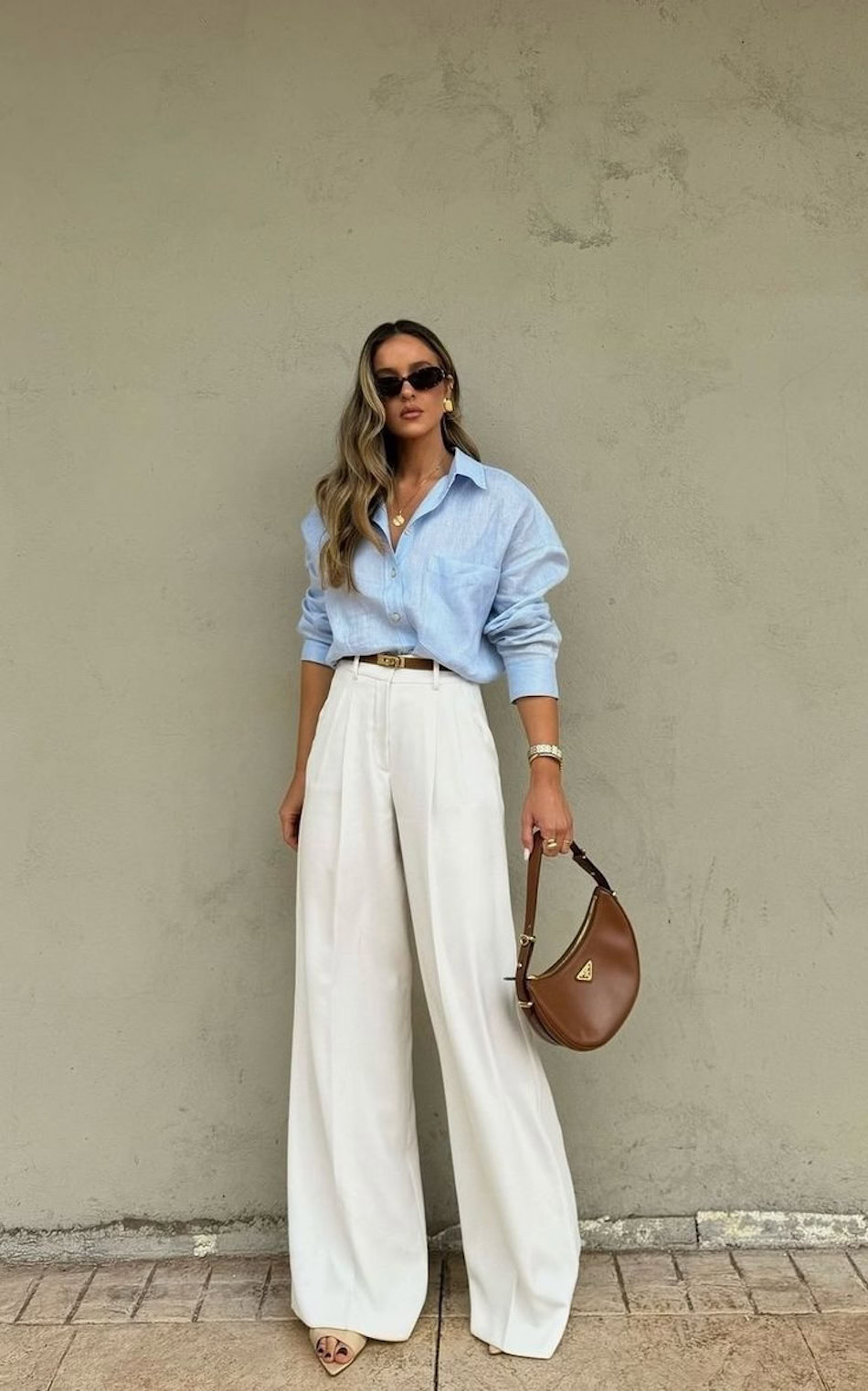
The first color combination that always looks expensive is light blue with cream (or white).

This color combination is very crisp, clean and fresh.

It’s just a relaxed, rich, elegant look that always looks nice together and makes your outfit look expensive.

This specific color combo looks particularly nice in the spring and summer months. I would recommend accessories that are gold and adding a little bit of tan or brown leather as a very luxe addition to the look.


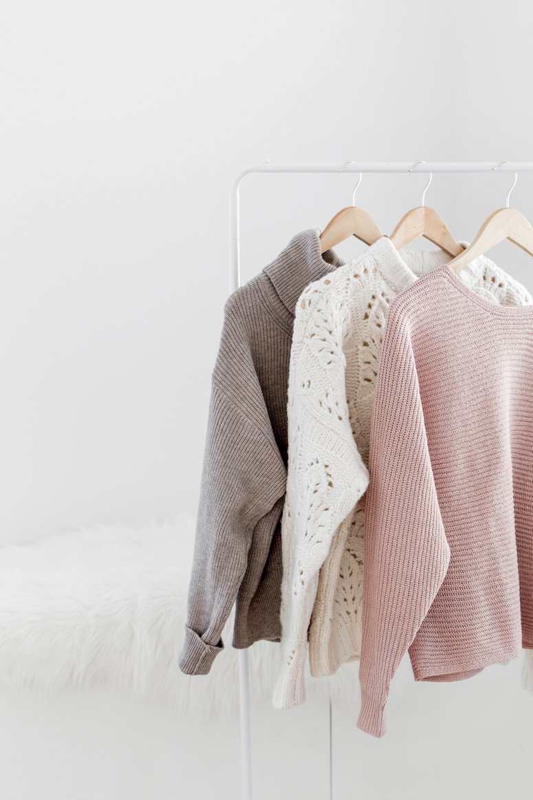
2. Camel and Cream

The next color combination is definitely more neutral, and that is camel and cream.

When I think of quiet luxury, the rich mom aesthetic, or how to look expensive, this is literally the color combination that comes to mind.

This is one of the most classic, effortlessly elegant color combinations on this list.

This color combination really never goes out of style. It’s very timeless, it’s soft, it’s neutral. And while these colors play very well together – it’s almost monochromatic, but not quite.

This particular color palette looks great year-round.

3. Cream and Brown

Camel and brown is another expensive color combination that is absolutely timeless. This color combo is like the counterpart to the one above because but leans more fall and winter.

When styling neutrals, pay attention to your fabrics. It’s a little bit more obvious if you’re wearing a cheaper fabric versus a nice fabric when your entire outfit is neutral. There’s a reason that a sheer white t-shirt looks super cheap, but the quality isn’t as noticeable when you’re wearing black.

4. Navy and White

Shifting gears a little bit from the neutrals, let’s talk about navy. This is such a beautiful, rich hue, specifically navy and white for those coastal vibes.

I noticed when I was looking for photos that navy seems to be a favorite among the royals, and that’s because it’s a lot softer than black. It’s not as harsh, but it’s still very deep, rich, elegant, and sophisticated.

Navy and white always looks expensive, and looks especially nice in the summer months though it can be worn year-round.

If you wear navy with crisp white, it has very summer nautical vibes.

Head-to-toe navy also looks expensive. This is almost monochromatic, but broken up with a little bit of brown or a little bit of gold.

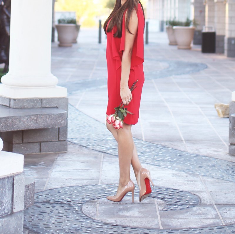
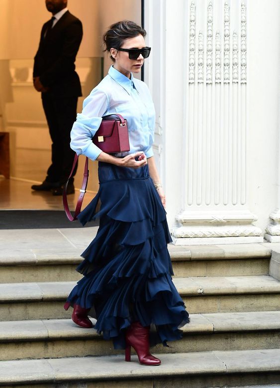
5. Burgundy and Gray

Burgundy and charcoal gray is timeless and always looks expensive, refined and elegant.
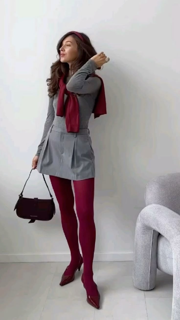
It is definitely more of a fall-winter color combination because burgundy is just such a deep, beautiful hue.

It also happens to be very trendy for 2025, so if you love this color combination, then you’re going to see plenty of pieces to choose from, and it looks really nice when paired with gray.

6. Black and White
Black and white is a timeless, elegant color combination that always looks expensive.
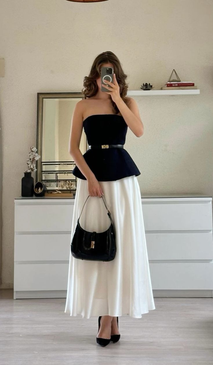
Not only is it seasonless so you can wear it all year round, but it also transitions really well from day to night.

You can wear black and white to the office and then still wear black and white to dinner later that night.

Or you can wear black and white earlier in the day for brunch and then go for dinner and drinks. It just goes well from day to night and season to season.


One quick style tip regarding black and white: black is such a strong color and very high contrast, so you’re going to want that to be the anchor of your look. If you’re adding a belt or bag or shoes, you’re going to want the black to anchor the look and have the white play more of an accent role.

The other nice thing about black and white is that you can really choose whatever tone metal–it looks great with silver and just as great with yellow gold. You can pick whatever looks best on you.
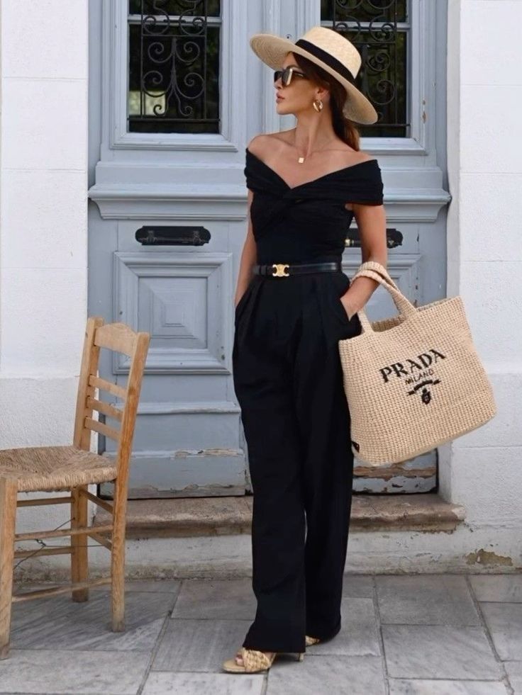
7. Black and Beige

If you don’t love the high contrast of black and white, then you can try black and beige. This also looks very rich, luxe, and expensive, but it’s a little bit warmer too.

This expensive color combination is also seasonless and looks just as good in the summer as it does in the winter months.

Again, just like with black and white, with black and beige you really want the black to be the anchor to your look and then style your accessories and everything else around it.

8. Ice Blue and Navy


I feel like a lot of these have been really serious color combos – very professional, take-me-serious, not as laid back. Whereas this one feels light and fun: ice blue and navy. While this isn’t a color combination that you see together very often, it’s beautiful and looks expensive.

Navy on its own exudes elegance and looks expensive. Paired with ice blue, it’s a fun and feminine look.


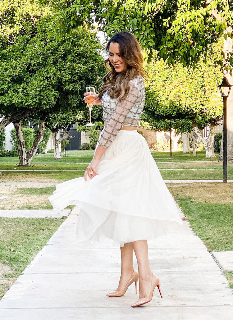
9. Olive Green and White (or Cream)

Another expensive color combination to try that always looks luxe is olive green paired with white or cream tones.
It’s very much giving safari vibes for me–elegant safari. You’ve got your khakis, maybe an army green button down or an olive green button down, and it can look very luxe and very expensive.

The nice thing about this color combination is that it tends to be flattering on a lot of different skin tones. It looks particularly luxe when paired with gold accessories.
Bonus Tip: Go Monochromatic


If you’re not sure what color combinations to try, you can literally take any of these colors on this list and wear it head to toe and it’s going to look expensive.


It’s also easy to do–you don’t have to worry about what shoes go best with what specific color because if you’re doing monochromatic, it’s just fool-proof expensive look!